Photoshop is like grandfathers workshop. There may be 20 similar tools at at first glance most of them feel dispensable and the whole shed looks messy, but your grandfather knows where everything is, what to use first and which version of which tool is best for the task at hand.
Video of the view from the ISS at night, where can I book? Video by Knate Myers.
(via darrengeraghty-blog)

Olly Moss art show, simply great graphic design.
Flying People in New York City. Three human shaped RC planes were flown around New York City to create the illusion of people flying. The flying people campaign created by marketing agency Thinkmodo is to promote the movie Chronicle in which three average teenagers get superpowers.
Chronicle is scheduled for theatrical release in the U.S. on February 3rd, 2012. Check out the trailer and more background info at Screenrant.
The guys from DKNG shared the workflow of the creation of their new poster: The Black Keys. Every step of the process is shown in this video. Nothing but props for Dan Kuhlken and Nathan Goldman for giving us some insight into their workflow!
This limited edition poster is for sale and be sure to check out more DKNG work after the jump.

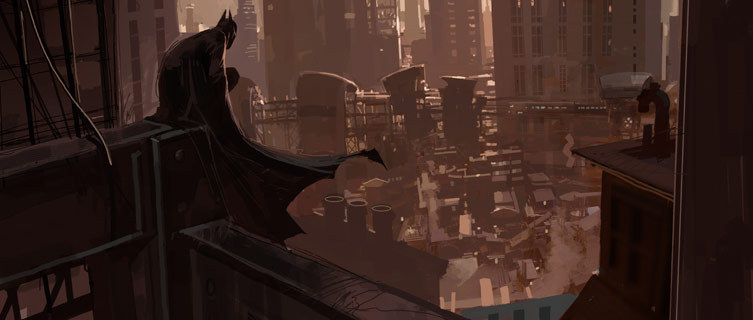


Concept artist Dermot Power created this beautiful concept art for Batman Begins. He also created concept art for V For Vendetta, Alice in Wonderland and Star Wars episode II.
Read more about his work at interview link 1 or interview link 2.
Mexican graffiti artist Sego Y Ovbal shared a workflow video of one of his latest creations made in Mexico City back in 2010. He creates unique insect like creatures. Check out more of his work on his Flickr or read his (Spanish) blog. While googling I also came across this interview by Art Asylum Boston that gives more background information about this talented artist.
Link via Steven Spavento.


Sucker Punch workflow: Concept Art
In case you need introduction:
“Sucker Punch” is an epic action fantasy that follows a young girl through her vivid imagination to provide an escape from her dark reality. Unrestrained by the boundaries of time and place, she is free to go where her mind takes her, blurring the lines between what’s reality and what is imaginary.
Director Zack Snyder said that he wants Sucker Punch to appeal to those looking for hidden meanings, as well as those fans who just want “crazy shit” in the movie.
I honestly think you can do both. I love crazy shit in a movie, don’t get me wrong. By the way, there is crazy shit in my movie. There is nutty, crazy shit in it but I’d like you to be able to have your cake and eat it too. I want you to be able to just go nuts and then also be able to sit with your friends afterwards and go, “No way, dude. You don’t get the socio-implications of this fuckin’ movie.” And the other guy going, “I don’t know what the fuck you’re talking about!”
Knowing this, without even seeing the movie, I can really appreciate the concept art. Having worked together with concept artists like the creative geniuses from KARAKTER Concept from Berlin and our own Monster illustrator Joeri Lefévre, I know that concept artists love creative freedom (not unlike any other designer). And reading Snyder’s quote I can only conclude that the creative workflow for Sucker Punch must have been a blast! Can’t wait to see the result on the big screen, IMAX of course.
Read the entire interview with Zack Snyder at Screenjunkies. More about the concept art (gallery image 1-8) on Jerad S Marantz’s blog. The posters (gallery image 9 & 10) are created by designer Ken Taylor for Mondo.
A peek into the design workflow of Wim Crouwel, the Dutch Graphic Designer
“For me it is always a question of thinking before sketching,” explains Wim Crouwel, the Dutch graphic designer. “A design ripens in my head, and then I see it more or less in front of me, before I take a pencil and do it on paper”.
Wim Crouwel started his design career over 60 years ago as a design student at Academy Minerva (Dutch site). After moving to Amsterdam he joined the Gerrit Rietveld Academy where his career really took off. Crouwel was part of the founders of Total Identity (1963), an Amsterdam based corporate identity studio set out to change Dutch design. He was responsible for the graphic design at the Stedelijk Museum Amsterdam. And he designed the Dutch expo at the 1970s World’s Fair at Osaka, Japan. In other words a designer I think we should know and listen to.
Interested? Check out Wim Crouwel: A Graphic Odyssey at the Design Museum London from 30 March - 3 July. The exhibition explores Crouwel’s innovative use of grid-based layouts and typographic systems to produce consistently striking asymmetric visuals.
Page 1 of 5
